New: Meetings View

At Parabol, we want every team to have their best meeting experience ever using our software. So when folks started writing that their teams were having trouble finding their meetings in our dashboard, we knew we needed to fix something.
While we focused on nuanced user job stories for team leads and facilitators, we ignored fundamental principles for good information architecture for every user. It was time to go back to the drawing board.
The result seems so obvious it’s silly for an app that provides meetings — we shipped a new Meetings view! Read along to learn more about the update and what our team learned in the design process.
How it works: a meetings view for easy discovery
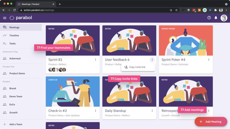
 From one place in Parabol you can find any active meeting for your teams.
Since you’re coming to Parabol for that rich meeting experience, you’ll see the Meetings view first when coming to the app.
For some teams or some people, you may have many meetings open for various reasons – maybe you’re collecting feedback async across a few teams – so we wanted to make it easy to find the right one to jump into.
We were inspired by the experience of seeing team members go towards the right conference room: avatars will appear when someone is viewing a meeting. Just follow your team.

From this same spot, you can tap the menu to copy and share a link to the meeting, to help new folks join in the right spot.

By focusing too narrowly, we were missing the bigger picture
When we first designed Parabol, we worked from a team-first principle. We assumed folks would join a team, and then look for the team meetings, tasks and other elements within that ‘team’ space.
Folks would land on their team’s Kanban. If somebody started a meeting, they would get notified. If somebody shared a link to a meeting, they’d get redirected right to the meeting.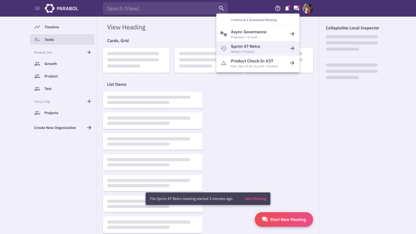 To craft this approach, we’d really thought about team leads and facilitators. We felt that if we got it right for them, it’d be easy for the rest of the team to follow along.
How we thought about the team lead’s experience was:
‘I want to start the meeting, and my team will be notified to join.’
These were good assumptions, but once users got involved, we saw the flaws. 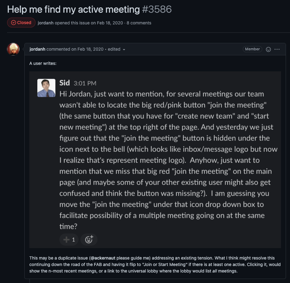 Folks were often logging in and not finding their meeting. They were missing the notifications. The meeting link security was too restrictive, often timing out before they could get into their meeting. The main reason for using Parabol -joining meetings – was hard to find in our information architecture. ♂️
Unlike team leads and facilitators, team members weren’t willing to click around and find out – they had no incentive to do so. What’s worse, this poor structure was leaving facilitators (our ‘primary user’) in the lurch, as they had to explain to their team members how to navigate the tool.
To address the ‘Where’s my meeting?’ problem, we rethought the idea of ‘primary user’
To address the ‘Where’s my meeting?’ problem, we revisited our core principles. Back to the drawing board, as they say.
Instead of treating this as a team-first UX, I wondered, what if we treated this as a bottom-up UX? What if every user was the primary user, not the team lead or the meeting facilitator.  Once we did this, the solution was obvious. Folks come here for meetings and so they need a simple view showing them all of their meetings.
For most users, the experience is:
- I’ve come here from a calendar invite. Where do I go?
- I just joined this team…how do I see what they’re seeing?
For team leads, the real experience is more like:
- I want to get my team to the right spot, without worrying that they’ll get lost or confused
- I want to link to the right place on a calendar item when I set it up
By making the way-finding more obvious, we could support a larger portion of our users, and save some hassle for facilitators and leads.
If we get it right for the most common users first, then we can get it right for the team leads.
That’s what we’re hoping for with this new meeting view – a solution that prioritizes the more common user experience and makes it easy to get where you’re going.
Love what you find vs find what you love
With this shift from a team-first- to a team-member-first UX, it’s reinforced for us that different types of users are in different modes, and more or less incentivized to work to figure out the path forward.
The average user is in a ‘love what you find’ mode.
‘Love what you find’ mode: a state where you explore a tool or experience and discover what works or doesn’t work for you about that thing
For most users of Parabol, they only want to spend as much time in Parabol as they need to for team ceremonies, then they want to get back to work in the tools that they use to do their work. They’re in ‘love what you find’ – already committed to a certain experience that the team lead picked, and not yet in love. It’s up to us to help them fall in love.
To that end, it should be easy to join and see what’s going on. It’s our job to show them the right things and give them the right workflows.
For team and org leads, they often switch to a ‘find what you love’ mode.
‘Find what you love’ mode: a state of exploring different possible tools, experiences and solutions until you find the one that fits best
These users are searching for the right solution. When they come to use the tool, they’re aware of alternatives, and incentivized to make the tool work for them – it’s part of their job.
These users need to turn on a configuration or learn a few ‘power’ features that the average user may not use. They want to add Slack, GitHub, or Jira. They want to manage users or billing. They’ll learn these moves because they need to.
When we identify these modes of thinking it allows us to choose strategic principles for our product.
We treat every user as the primary use case. This is bottom-up UX, or ‘love what you find.’ The secondary UX is that of the team leads and facilitators who will more likely put in the effort to find what they need in the product.
If we get the primary use case right, the whole team can have a delightful experience interacting with their teammates and moving forward with greater trust, increased shared understanding, and clear next steps.
Find your next meeting without needing a map
With the new Meetings view, we hope it’s now easier for everyone to find the Retro, Check-In or Sprint Poker meeting they’re looking for.
By thinking about the experience of most users, we’ve created a new Meeting View to make it obvious where you need to go, and simulate the in-office experience of just following your teammates to the right place.
How’s it working for you? Are you finding what you love? Reach out and let us know how it can be better – that’s what starts the whole cycle over again.

