New: Expand Columns in the Group & Vote Phases

When we’re organising the real estate on your screen, we try to be super thoughtful about making the most of the space available. If the screen is too congested, it can feel overwhelming. If there’s too much empty space, it can be difficult to take everything in.
Wherever possible, we want you, the user, to have control.
With that in mind: you can now expand and shrink columns in the group & vote stages of a sprint retrospective to organize your experience as you see fit.
How It Works: Just Take the Wheel
Every team, person and meeting is different, so we feel that you should be able to arrange your meetings in the way that works for you..
Let’s say that you’re running your retro from a tablet, you have a bunch of prompts and you don’t really care about the sidebar. Simply collapse that sidebar to give yourself more room to breathe.
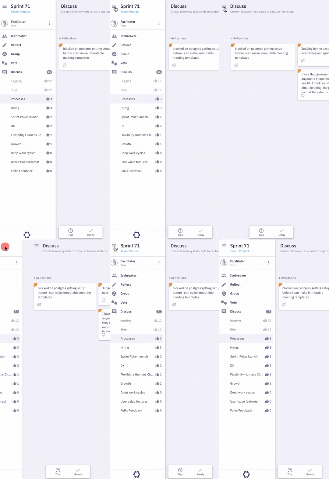
How about that meeting control bar at the bottom centre of your screen? Maybe you’re a participant, you’ve clicked ready already and you don’t need it anymore. Well, slide that guy to the left or right and you’ll see that the column length extends to squeeze in an extra reflection. We wanted to make the retrospective columns just as flexible. Based on user feedback, we knew that they can sometimes feel a little crowded.
Perhaps your team are feeling on top of the world, you’ve cracked open a working-stuck retro and the “What’s working” prompt is overflowing with goodness.
Perhaps you’re reminiscing about 2020 and the glad section of Glad, Sad and Mad is a little sparse.
If a column is feeling congested, you can now expand columns to give yourself more room. Already got more space than you need? Well, shrink it back down.

Why Expand Columns: Optimize Your Space
We’ve found two main scenarios where the single-card-width columns were getting in the way:
- Many reflections
- Many prompts
#1: Many Reflections
Like in the Working & Stuck example, sometimes team have a lot of reflections for one prompt. Team members find themselves scrolling and scrolling, or lost in a column – it’s hard to find the card you want out of a long scrolling box.
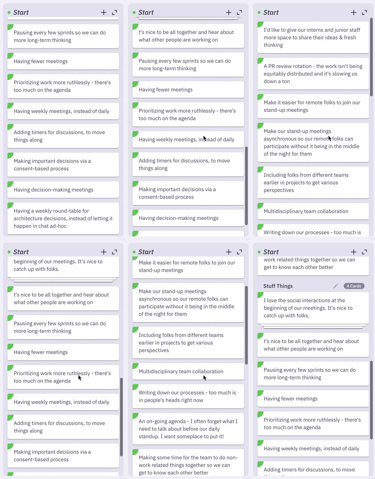
Especially as others start to group cards together, it can be really easy to lose your place, and waste time trying to find the right card.
We’ve heard this is particularly true for teams running end-of-project retrospectives, or reflecting over a longer period, like a quarter, where there tend to be more cards to work through.
#2: Many Prompts
On the flipside, use of space also becomes an issue when teams have many prompts to process.
We run into this on our own team when we use Parabol to find themes in user research. We’ll create a template where each prompt is a different user. In larger studies, we have 10+ users, which makes for a lot of columns. 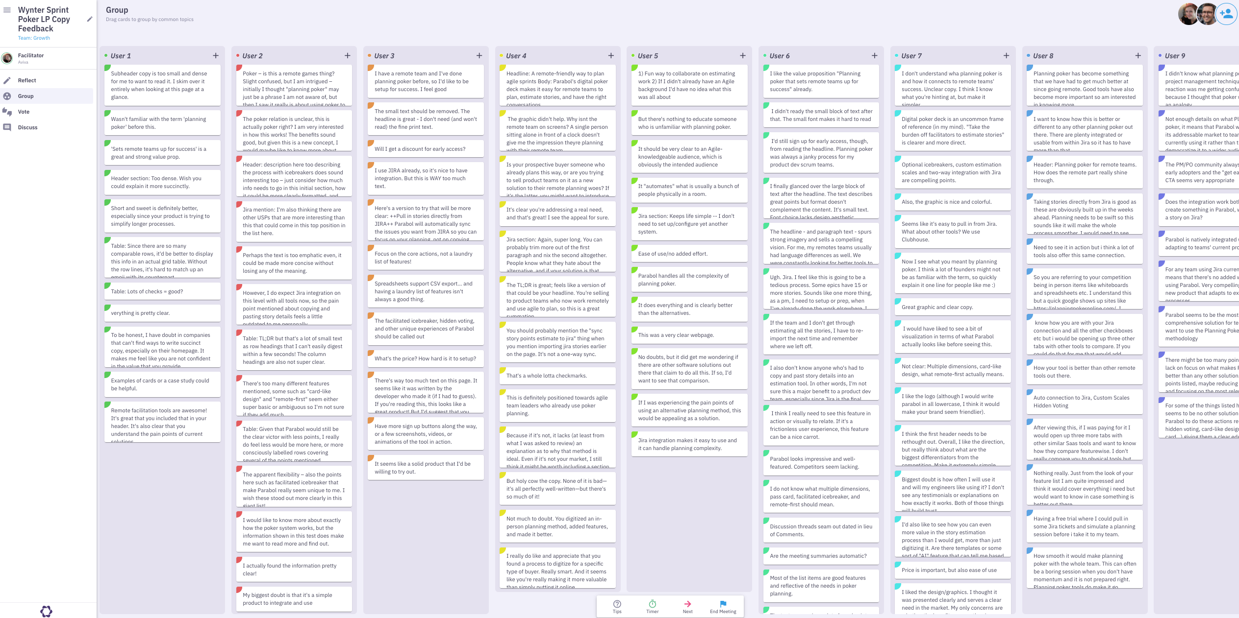 In those situations, we’ll typically start to use one column as a ‘home base’ – bringing cards from other prompts into that one, where most of the groups live. The ‘home base’ column starts to get rather long, and again, we can lose sight of where certain cards or certain groups live.
With these two use cases in mind, we set out to make something better.
Agile Process in Action
We don’t just preach agile, we live it. We believe that an iterative process is the most effective way of building products that users love. If you’re working on a feature and the initial objective no longer feels right, discuss it as a team and reassess.
That was the case with this feature.
It seems simple enough, right? Just double the width of the column when the user clicks expand.
Well, if there’s enough space available, why should the user have to click expand? Let’s save them some clicks and expand all of the columns by default if there’s space.
What if you still need to scroll down to see all of the reflections even though the column is twice the width? If there’s space for three, four or more sub columns, why not expand it further?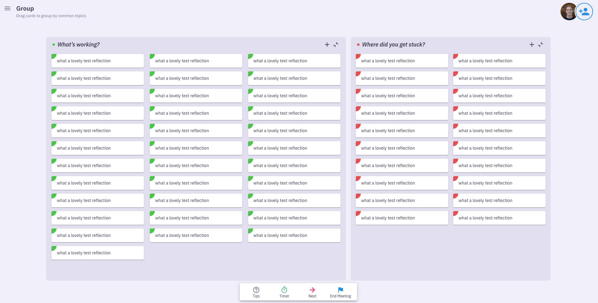
That feels better. Now we can see all of the reflections without needing to scroll. Finished!
But wait.. what if you’re on a smaller screen?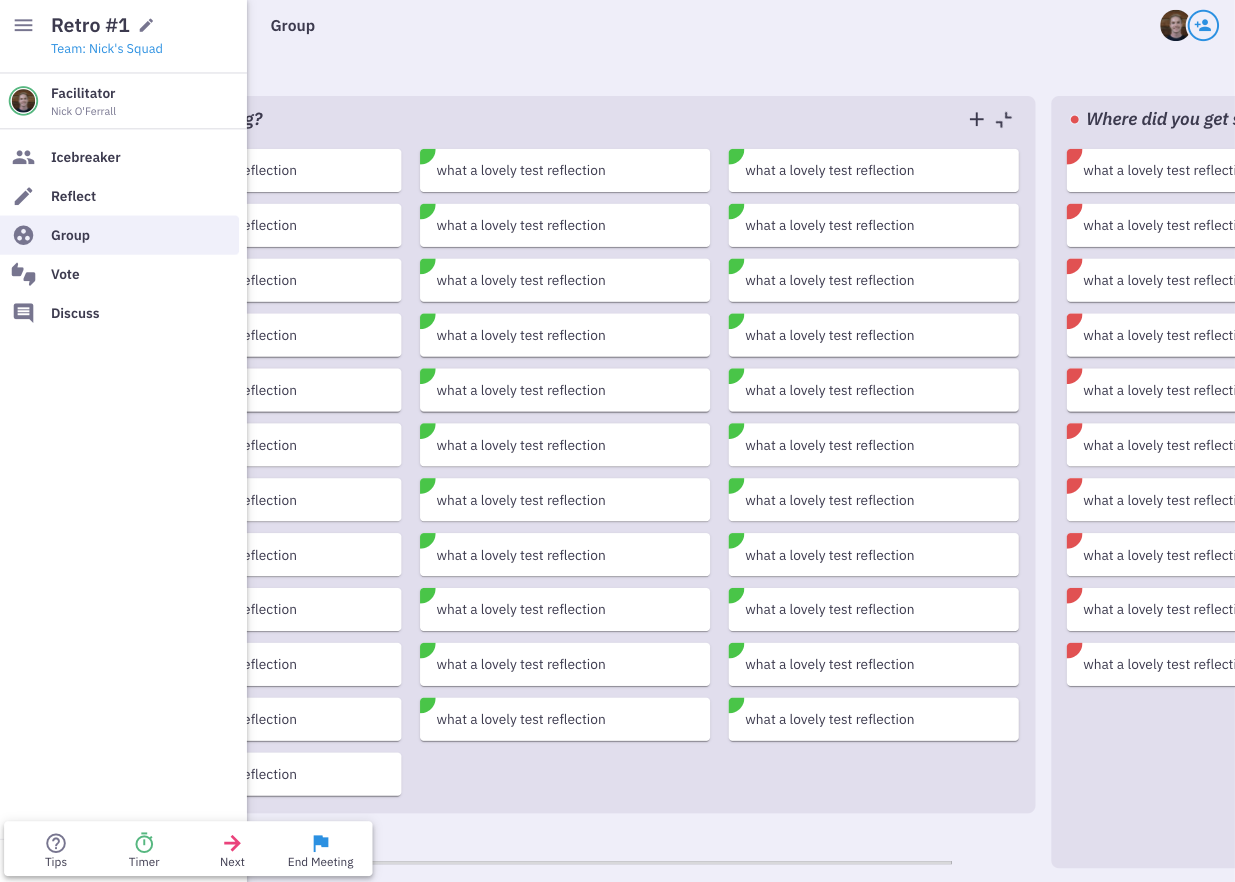
Expanding “What’s working” to be three cards wide means that we don’t need to scroll down but we now need to scroll from left to right. That’s even worse!
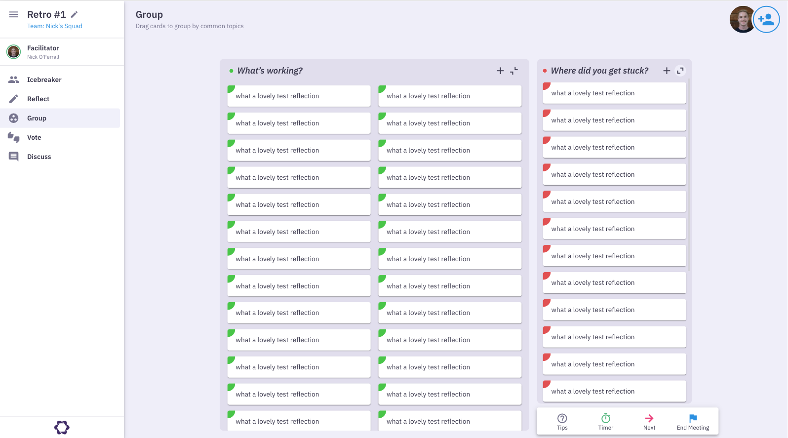
The approach that we went for in the end is:
- Initially expand the columns if there’s space
- If you click expand, expand to the width that removes the vertical scroll bar without causing a horizontal scroll bar
- If you click expand and there is already a horizontal scroll bar or if two-cards-wide will cause a horizontal scroll bar, expand to the width that removes the vertical scroll bar and accept the horizontal scroll bar
- Never make a column wider that the width of the screen as that’s just ugly
As with everything we do at Parabol, it’s always a work in progress. If users would prefer to organise their sprint retrospective in a different way, we’ll listen and we’ll act.
The Queen’s English
Parabol is a globally distributed team that celebrate each others’ differences. As Parabol’s first developer from the UK, I was particularly delighted to sneak some British English into the codebase on this feature.
Eagle-eyed readers may have noticed the “minimise” tooltip when hovering over the minimise button.
Want to bring your own dialect and differences to Parabol? Great! We’re actively hiring and you can find open roles here.
Make Your Sprint Retrospective Work for You
Like collapsing the sidebar or moving the meeting control bar, we hope the option to expand and collapse columns lets you take the wheel and organize your retrospective screen in the way that works for you.
In particular, teams that add a lot of cards to any one prompt or those that like scrum retrospectives with many prompts should now have an easier time.
Comments or questions? We love hearing feedback! Let us know what you think.

