New: Color-code reflections in sprint retros
Stop lights. Poisonous frogs. Moldy bread. Every day, colors help direct our attention so we can make smarter decisions. In our digital lives, they play the same role.
Done well, colors can translate directly into meaning, obviating the need for words or extra thinking. Done poorly, it looks like someone had too much fun with playdough.
In our undying quest to make the best retro experience ever, we’ve added customizable colors to every reflection column.

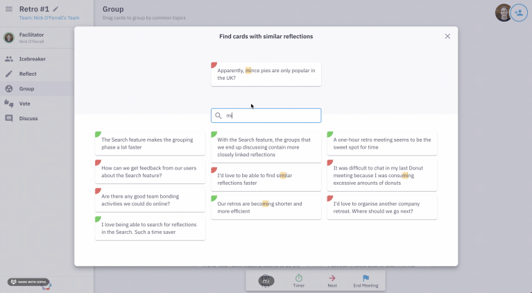
With the latest version of Parabol, reflections have a spot of color so they can be associated with the column they were added in.
Built-in templates include default color-coding for smoother retrospectives
Folks have been asking us to add more color to their retrospectives.
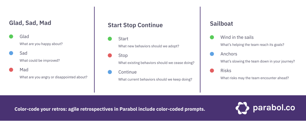
Currently, we offer five default templates for retrospectives in Parabol – Stop Start Continue, Glad Sad Mad, Sailboat, 4Ls, and Working/Stuck. With this release, we’ve added default color options associated with columns in all of our templates. They work similarly across all templates:
- Green = positive things you want to keep doing
- Red = challenges or problems you want to resolve
- Blue = neutral feedback that you want to process
Adding this color coding into our templates by default means you don’t need to take any steps to enjoy color-coded retros – they’re ready for you.
Because our color-coding has a similar meaning across prompts in different templates, we hope color coding will also reduce your cognitive load as you engage in more retros with different templates. If a Sailboat retrospective feels like a really abstract concept but you’re already a master of the other templates, we hope adding the simple color cues makes it more accessible.
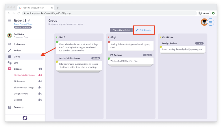
Color coding makes it easier to see themes in the grouping phase of your retro
We heard from a few users that they wanted to see what category a reflection belonged to when they were moving it around in the group phase.

Color-coding makes grouping reflections together a breeze. This visual separation makes it easy to see when a group includes a reflection that is from a different color, and understand the overall mood of a group by seeing how much of each color is present.
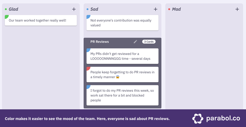
Your team doesn’t need to think as much to remember the flavor of a bit of feedback, the color gives you a hint about the nature of that reflection as you see it across the Grouping, Voting and Discuss phases.
Customize existing colors or color-code your own sprint retro templates
Of course, our default color-coding scheme might not work for your team for a whole host of reasons:
- Some team members might be red-green color blind, so having those as two of the three prompt colors doesn’t work
- In the culture or your team, company or country, these colors might have different associations – blue might not feel ‘neutral’ to you
- You might not be using our default templates at all, as you’ve developed your own custom formats
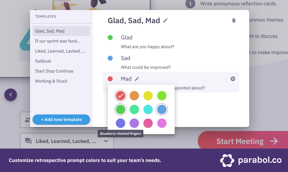
For all those use cases, you can customize colors in the built-in templates as well as your custom-made templates

When you’re customizing your color palette, you can see the current color for a prompt, which colors are already in-use and which other colors are available.
You may choose to use color in similar ways to our defaults – with green as go and red as stop – or you may use it in an entirely different way, to reinforce whatever creative template resonates with your team.
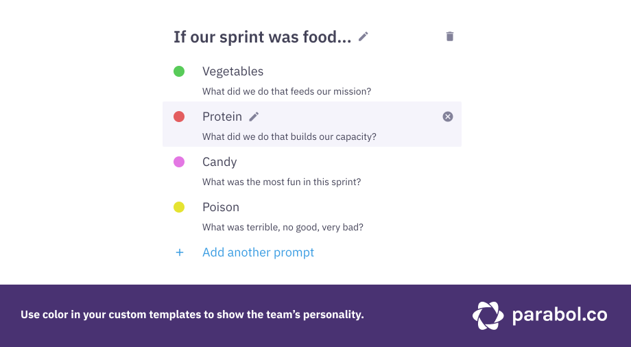
Whatever you chose, you can rest assured that we’ve explored this palette with the rest of our UI, so you can’t really go wrong.
Bonus: smaller reflection cards
From a design perspective, adding color-coding also helps reduce the size of a reflection card. By keeping the prompt out of the card, we can fit an extra row of cards on the screen. While it doesn’t sound like much, this added screen real estate is one of the many small changes that helps meetings feel run smoothly.
Are you ready to go technicolor with your agile retrospective?
Color coding is available in Parabol now. We hope adding color will make your sprint retros run just slightly more easily, make different types of templates more accessible, allow for another layer of team expression, and well, just add a bit of color to your work.

